わざわざのショップマーク
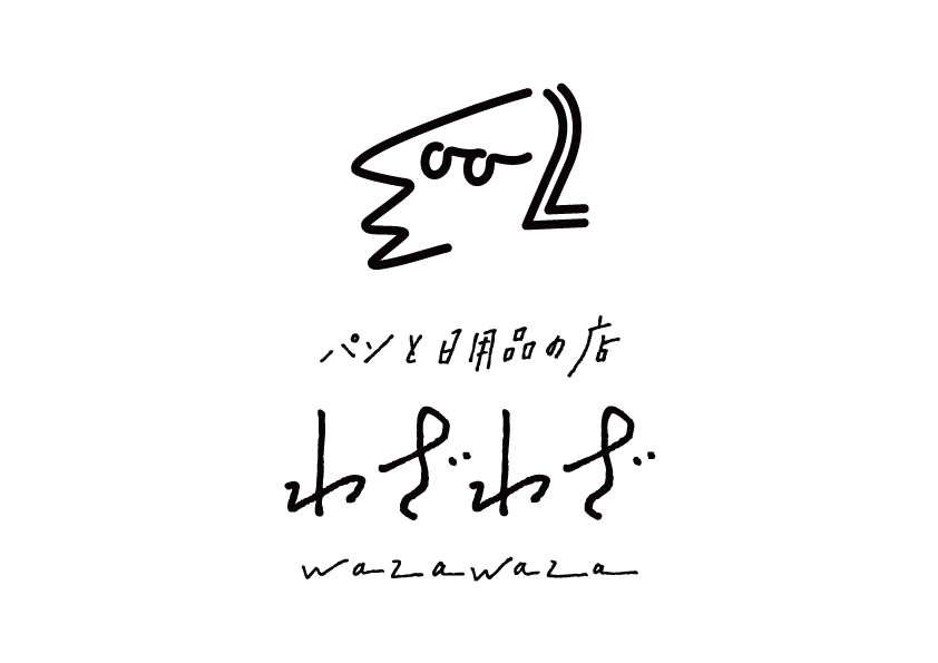

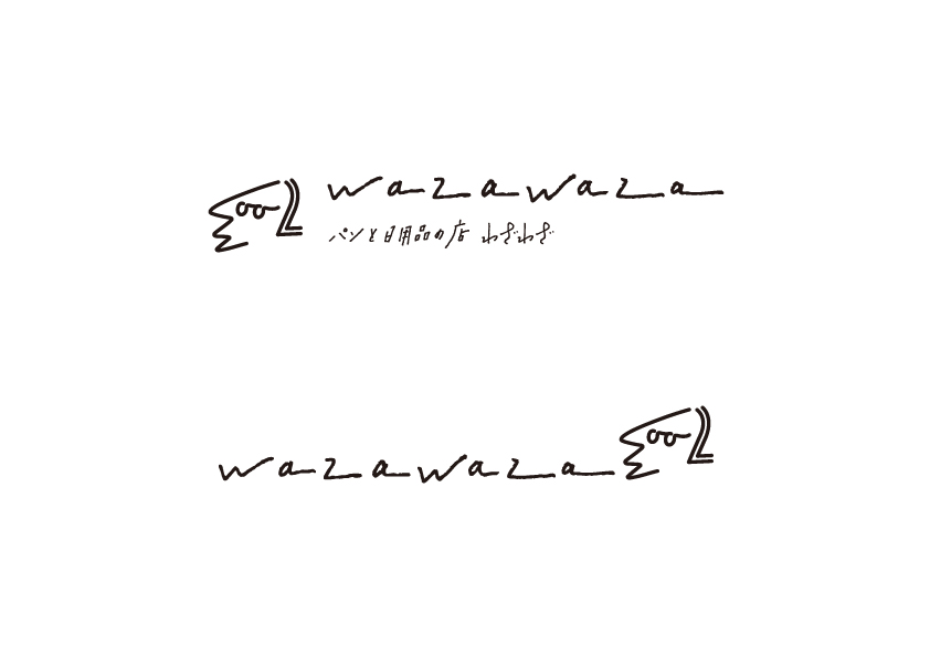


The store of bread and daily necessaries “wazawaza” is in Tomi-shi, Nagano. I had designed the original logotype in winter, 2015. And I started to design the original shop mark since summer in 2016. The owner’s request was simple design and versatility. The shop’s products ranged over various categories—bread, dishes, clothes, articles for cleaning purposes. So, I avoided to design the shop mark derived from each products and I considered to design that expressed the policy and philosophy of wazawaza. Of all the designs proposals, this shop mark was passed unanimously by all staffs. It consists of the characters of shop name, and at the same time it is the portrait of the shop owner. And the line from nose to mouse looks like the long road to the shop that we have to drive.
わざわざから、ロゴタイプの制作依頼を受けたのは、2015年冬。1年後の2016年夏頃から、ロゴタイプに合わせて使用するショップマークデザインが始まった。要望は、「シンプルさ」と「汎用性」。わざわざが扱う商品は、パンだけでなく、食器や衣類、掃除用品など、日用品全般に渡る。そのため、何か一つのシンボリックな商品を、ショップマークにするのではなく、わざわざのポリシーやあり方を表したデザインを検討した。いくつか提案したデザイン案のうち、スタッフの満場一致で決まったものが、このショップマーク。よく見ると、「wazawaza」の文字が隠れており、同時に、店のオーナーである平田はる香氏の似顔絵にもなっている。鼻から口にかけてのラインは、車で遠路はるばる向かわなければならない、店までの長い道のりも表現。「わざわざ行く甲斐のある店でありたい」という理念、強い個性と情熱を持った店主の似顔絵、そして店名の3つの要素が込められている。
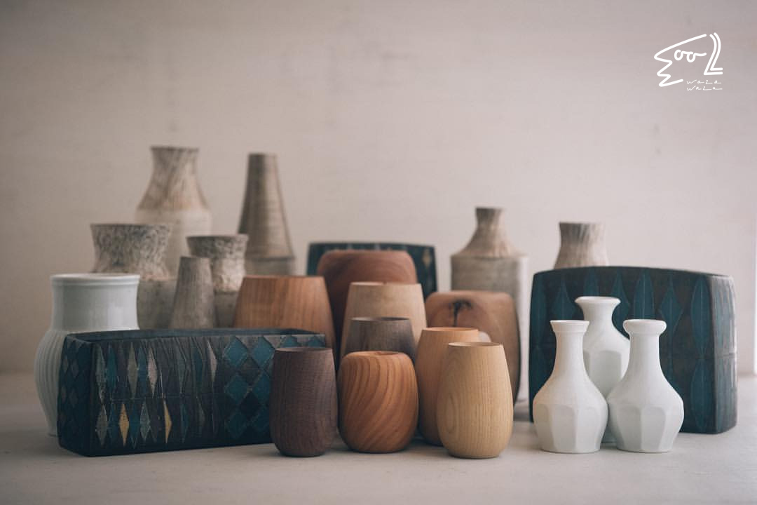
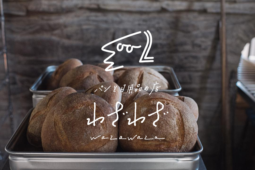
Client, Photos, Package Design: wazawaza
Direciton, CI Design: Go Uchida