ReBuilding Center JAPAN 事務用品

In Autumn in 2016, ReBuilding Center JAPAN was established in Suwa-shi Nagano by Takafumi Azuno and his wife Kanako Azuno. On the occasion of its establishment, first of all, I was ordered to design the shop mark of “CAFE live in sense” on the ground floor of its company building. And next, I started to design the office supplies business card or shop card or tags for ReBuilding Center JAPAN. The design base is a corporate identity that was given them from the originator ReBuilding Center in Portland, Oregon in America. Takafumi and Kanaoko were deeply impressed by its vision and guidlines, they negotiated directly in order to start business with the same vision and use the same logo. I heard this story and their thoughts before designing them, so I started designing each tools to use this logo with adding new interpretation of ‘their ReBuiding Center.’
長野県諏訪市に、2016年秋に設立された、建築建材のリサイクルショップ「ReBuilding Center JAPAN」。開業に際して、地上階のカフェ「live in sense」のショップマークデザインを請け負うとともに、母体となるReBuilding Center JAPANの事務用品—名刺、ショップカード、タグをデザインした。デザインのベースとなるのは、本場、アメリカはポートランドにある「ReBuilding Center」に直談判して譲り受けたという、CI。代表自らが、現地で出会ったReBuilding Centerの考え方に感銘を受け、日本で開業するに至った話を伺って、アイデンティティを受け継ぐこのCIを、さらに読み解いて、各ツールをデザインすることを試みた。
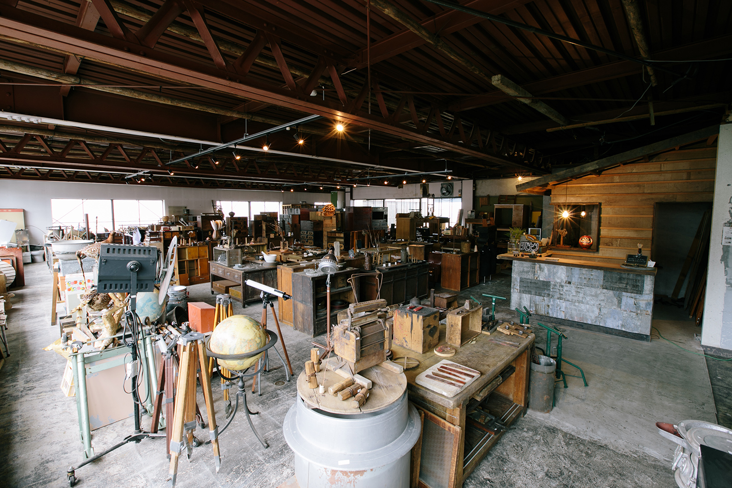

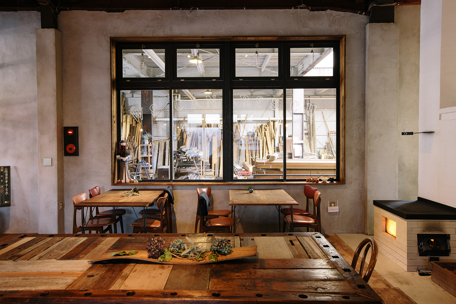
photo by ReBuilding Center JAPAN
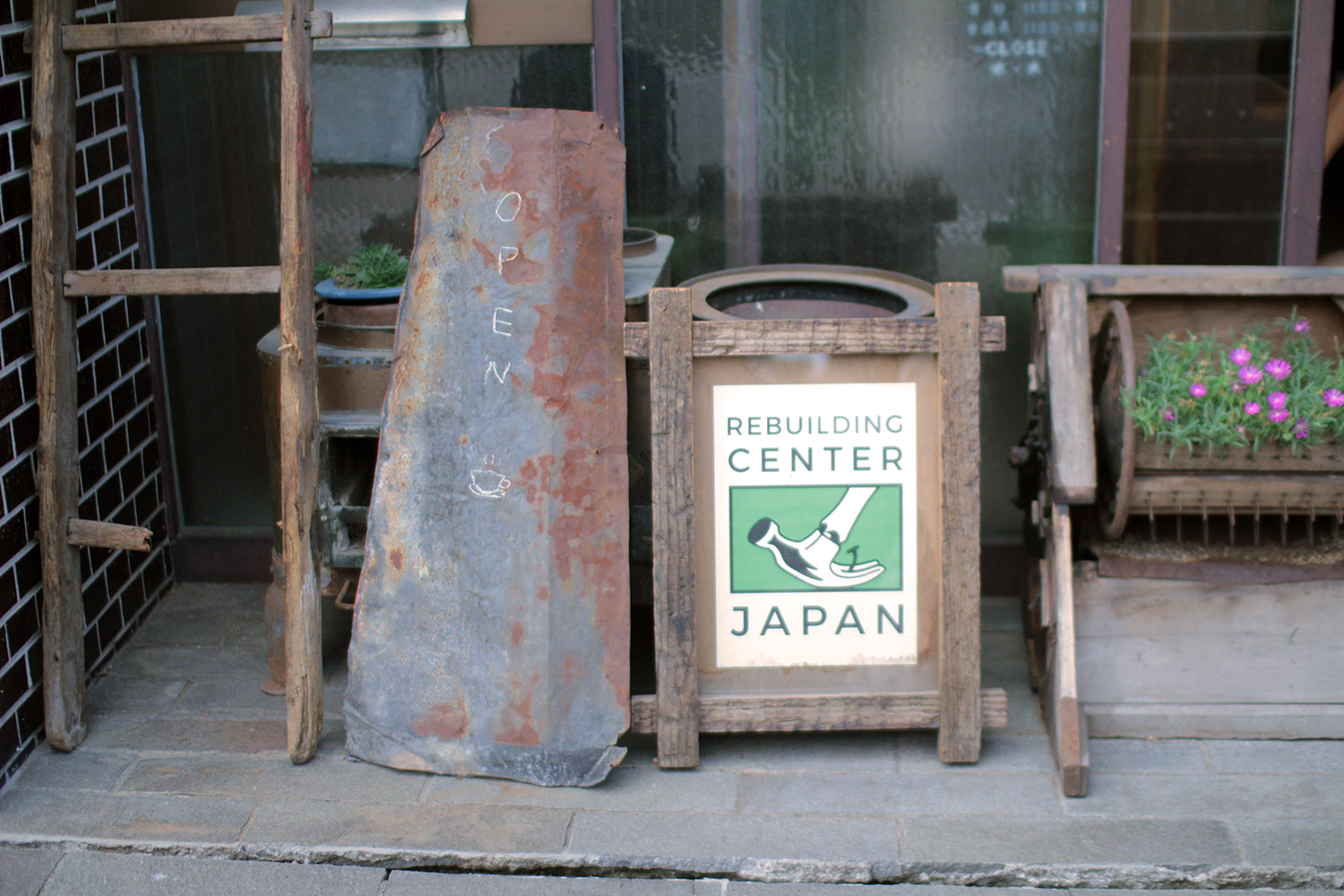
The greatest attraction of this company is very expressive face of old materials and secondhand articles that re rescued from several different demolition sites. Not just materials and aging, the living ways and thoughts of the former owner also is different ,so the floor where they gathers together is filled with diversity. This company’s culture that values diversity can be seen in various scenes—their original products and spaces to use old materials. Rescuing and watching various materials with each histories and thoughts from different environment, and giving them new life. This company philosophy is consistent to their customer who has had no choice except for buying new products through suggesting to use secondhand articles or to make furnitures by using old materials.
ReBuilding Center JAPANの魅力は、いくつもの現場からレスキューされてくる、古材や古道具の豊かな表情だ。素材や経年はもちろんのこと、それまで道具を使っていた人の暮らし、考え方も異なるため、それらが一堂に会したとき、その空間には多様性が満ちることになる。多様性を重んじる風土は、売り場の風景だけでなく、ReBuilding Center JAPANが自ら古材を利用して製作するプロダクトにも現れている。異なる環境から集まってきたモノの思いやあり方を見極めて、新たな生き方を授けていく。それは、これまで新製品を購入するという選択肢しか持たなかった人たちに、古道具を買って使うことや、自ら古材を利用して家具を作ってみることを提案したいという、ReBuilding Center JAPANの指針にも、通じているように思えた。
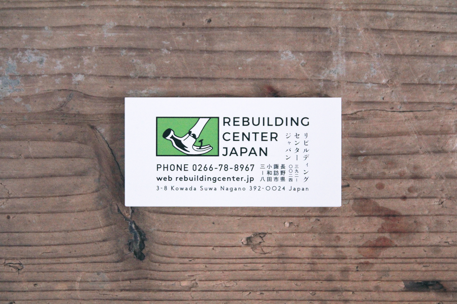
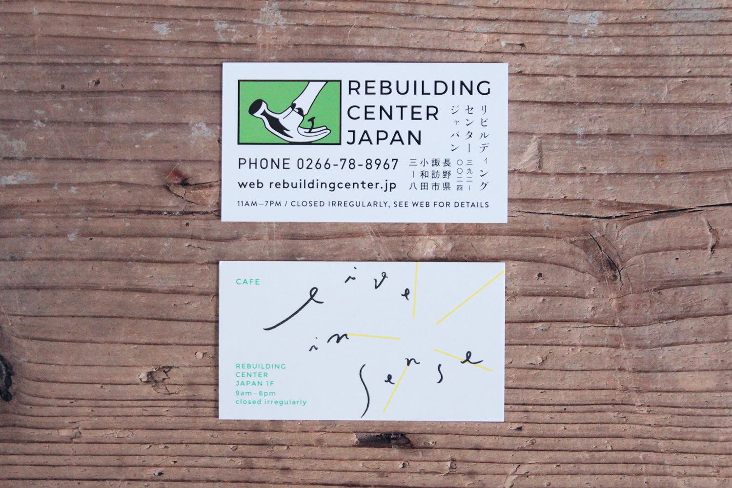
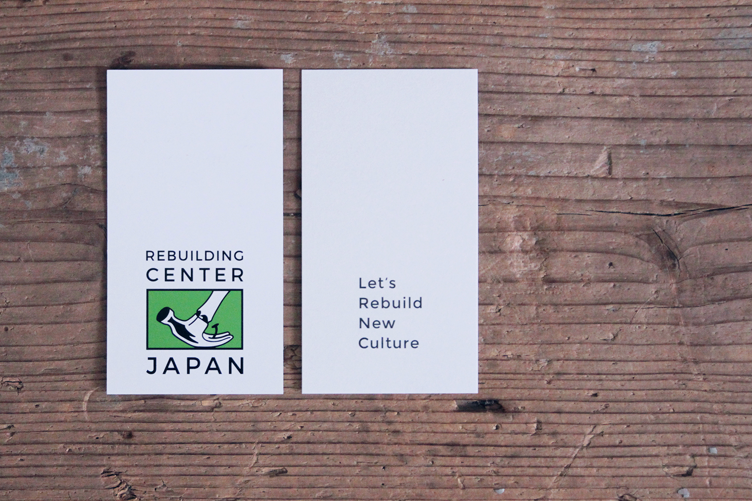
The business card and shop card were designed to be reflected the above background. At first, the corporate identity is used as is without changing the shape. On the other hand, all informations were used different fonts and I laid out to draw that different culture and and histories and thoughts create a beautiful harmony. And particularly we chose very unique paper having different texture on the front and back. The hard and slidable side was printed the information of ReBuilding Center Japan having great influence with sharp and clear vision, and the side soft in touch feeling was printed one of live in sense as entrance to understand its philosophy.
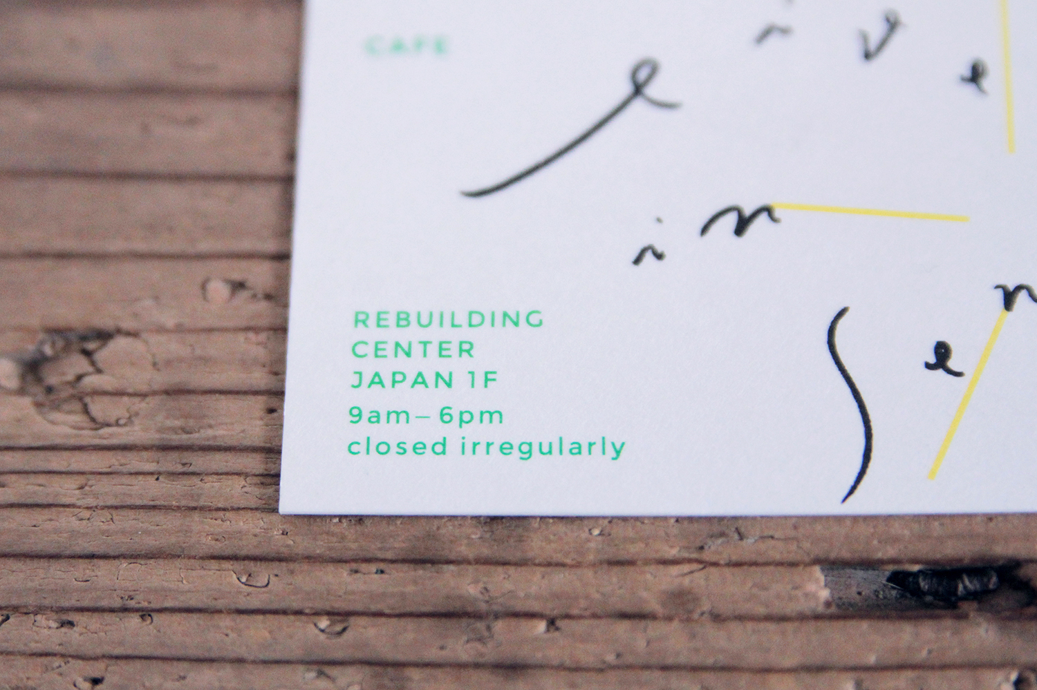
名刺やショップカードのインフォメーションは、こうした表情を反映させるようにデザインされた。まず、すでに使用されていたCIは、そのまま生かした。そして、そのほかのインフォメーション、社名の日本語表記、住所の日本語表記、住所の英語表記、電話番号、メールアドレスは、すべて異なるフォントを使用。レイアウトも一様にせず、異質なものが不思議とうまく調和しているさまを描くように、配置した。ショップカードに関しては、表裏で異なる肌触りのある紙を選択。大きなヴィジョンを持って社会に働きかける力のあるReBuilding Center JAPANはハードな面を、その理念に共感してもらうための入り口となるカフェ「live in sense」はソフトな面に印刷した。

名刺 / Business Card
ショップカード / Shop Card


商品タグ / Price Tag
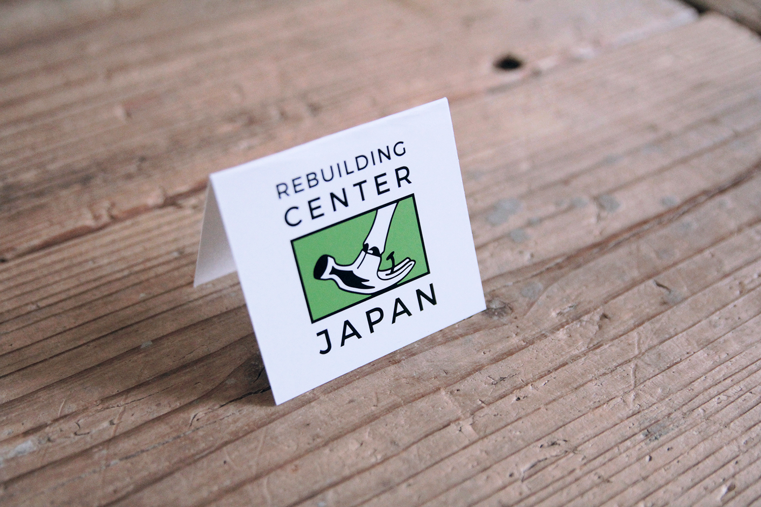

パッケージタグ / Package Tag
Client: ReBuilding Center JAPAN
Direction, Design: Go Uchida
Space Photo: ReBuilding Center Japan
Printing: Fujiwara Printing co.,ltd.