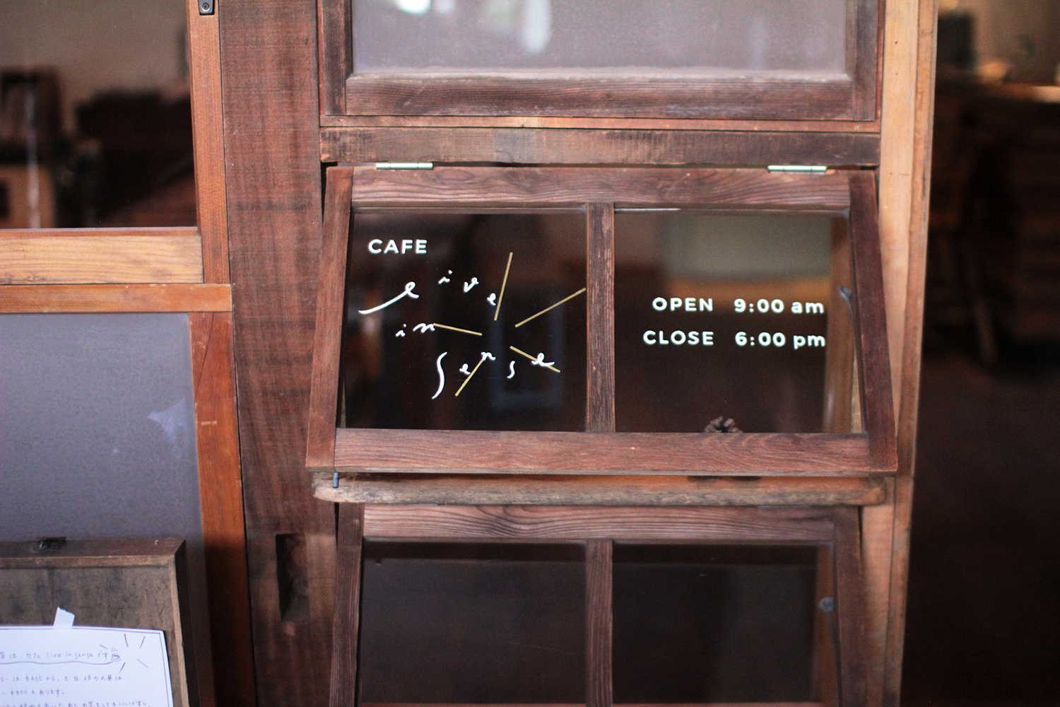
CAFE live in sense
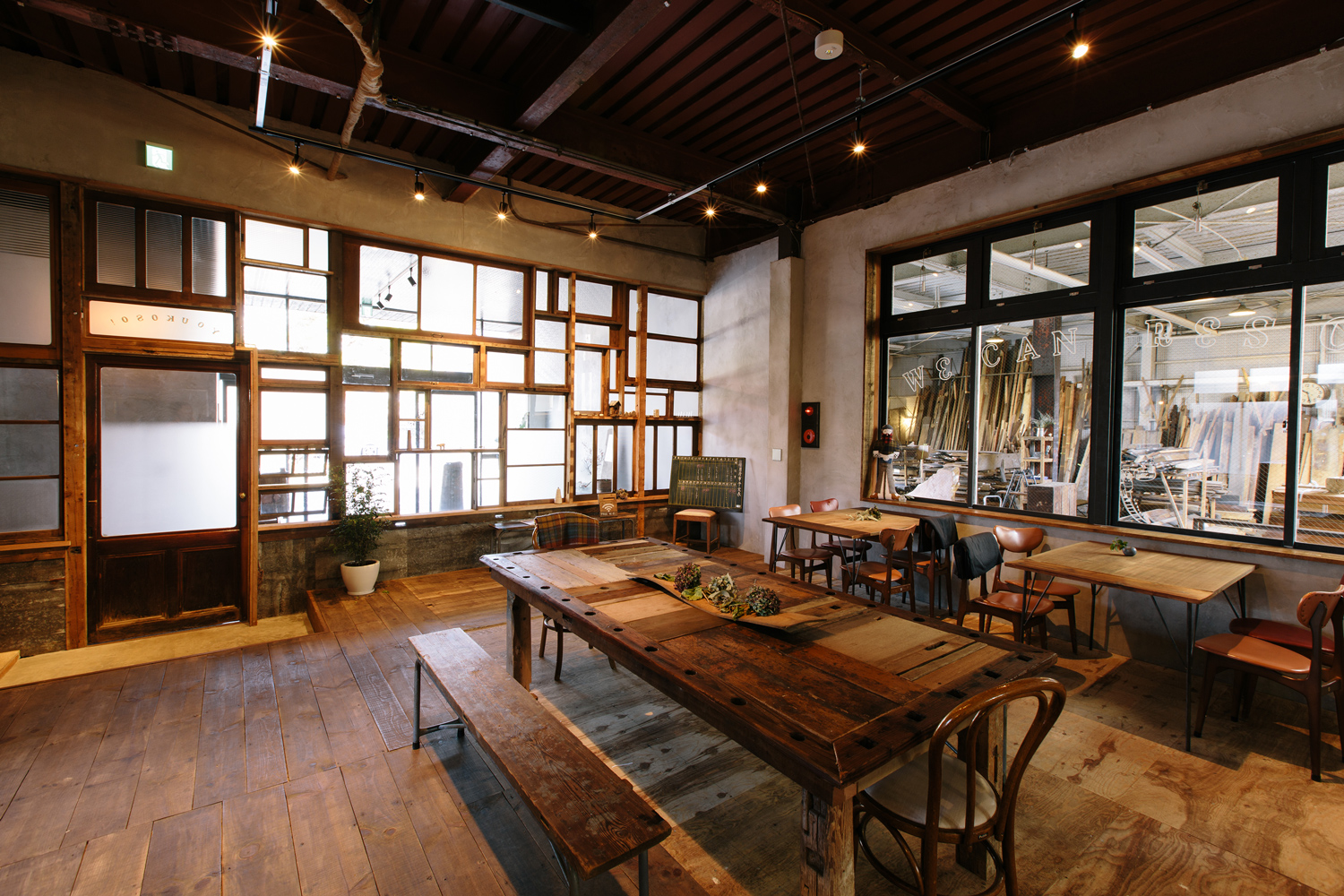
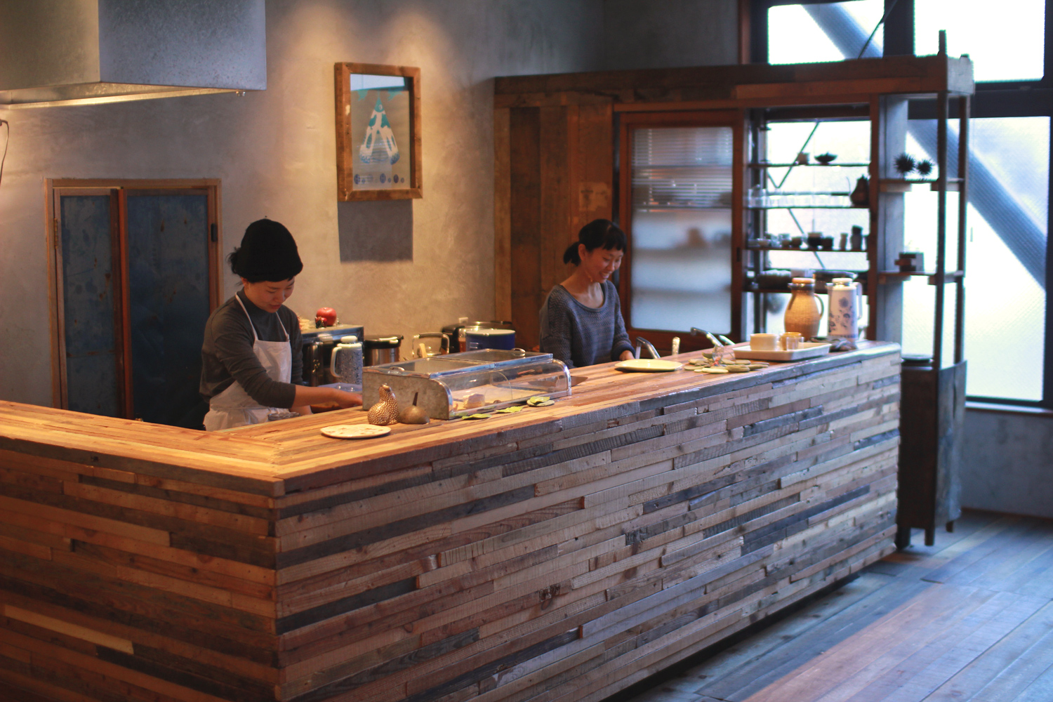
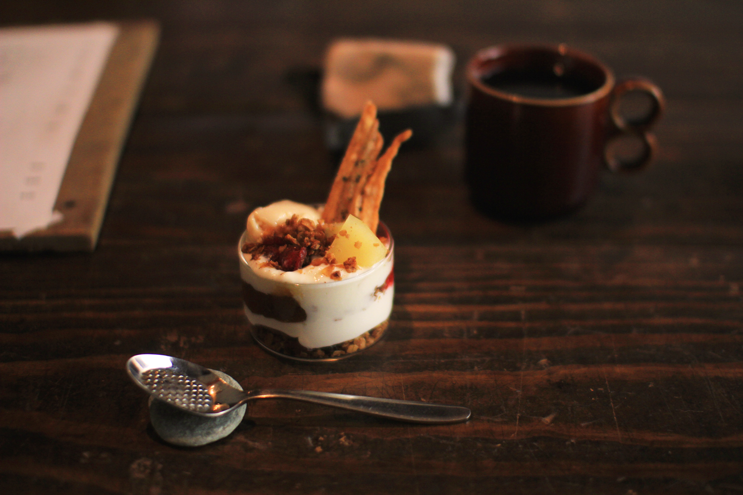
In Autumn in 2016, ReBuilding Center JAPAN was established in Suwa-shi Nagano by Takafumi Azuno and his wife Kanako Azuno. The principal business of this company is Rescuing old materials/furnitures and fitting for houses, Selling them and Suggesting new way to use them and their new values to us. Its most important guideline ‘ReBuild New Culture’—it means designing the vision for future that people can live happily and lively with rescuing and reconstructing resources and culture for the next generation. The company building has a cafe on its ground floor, the cafe’s name is “live in sense.” The customer can have a peaceful time with good drinks and delicious meals. And, at the same time, they can feel familiar with old materials because its space is made of them and holds some culture classes. The cafe is an ideal entrance to feel ‘ReBuild New Culture.’ From Autumn in 2016 through January in 2017, We were engaged in designing the shop mark and card of “live in sense.”
長野県諏訪市に、「ReBuilding Center JAPAN」が設立されたのは、2016年秋。近年日本で多くの古い建造物が解体され、様々な課題を抱えるなか、家具や建具、古材をレスキューし、古道具としてそのまま使うべく販売するだけでなく、新たな素材としてもその価値を見出していくビジネスをスタート。「ReBuild New Culture=次の世代につないでゆきたいモノと文化を掬いあげ、再構築し、楽しくたくましく生きていけるこれからの景色を、デザインしていく」という彼らの行動指針は、その後瞬く間に、多くの人々の心に響き、日本にひとつの新しい風を吹き込ませている。そんなRebuilding Center JAPANの拠点ビルの地上階にあるカフェ「live in sense」は、古材を身近に感じる空間だけでなく、金継ぎ教室などのワークショップ開催や、市場に上らない野菜の販売など、まさに「ReBuild New Culture」を誰もが感じられるようになるための、入り口となる場所。このカフェのショップマークとショップカードのデザインを請け負った。
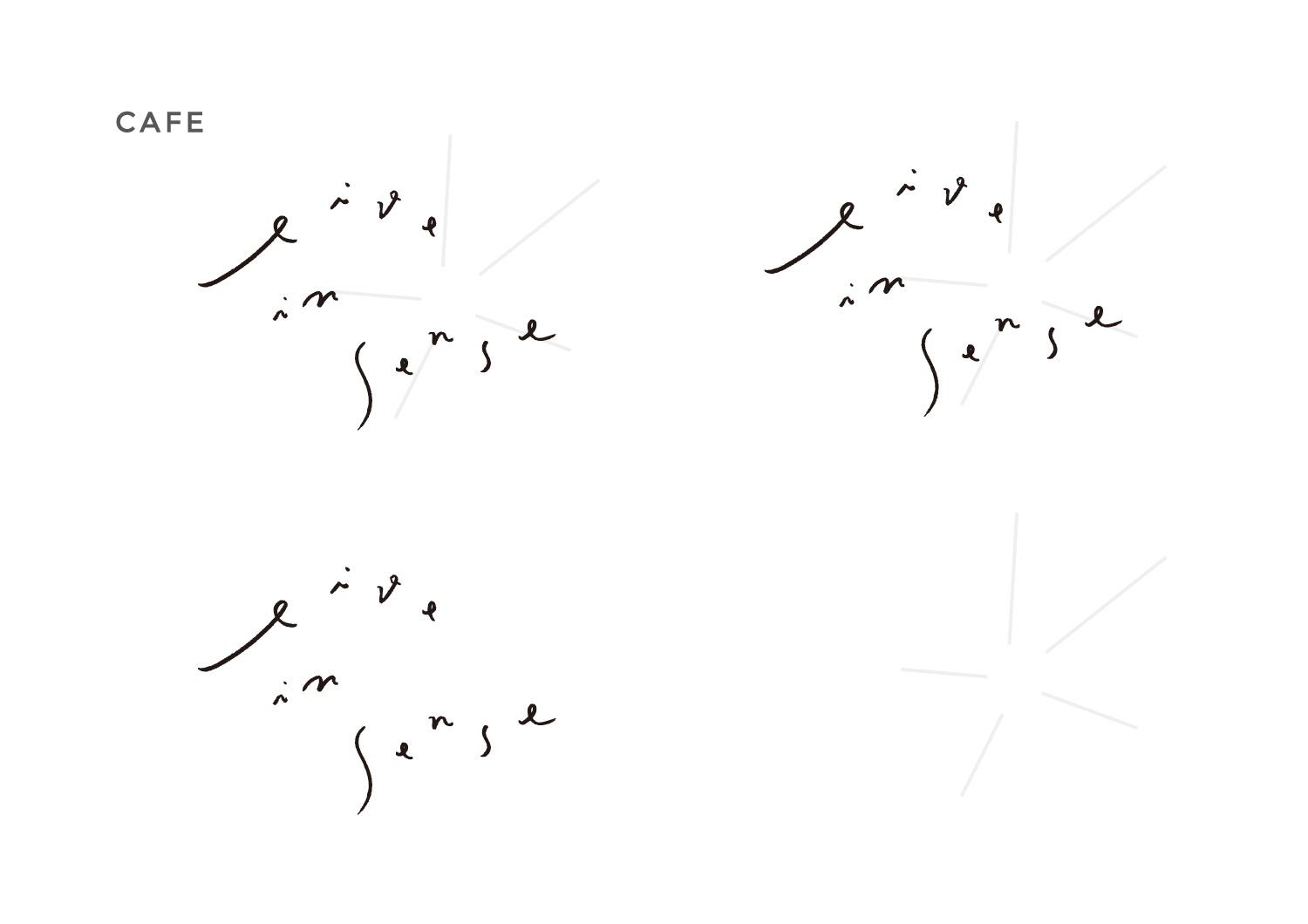
ショップマーク / Shop Mark

ショップマークの各パーツ / Each parts of Shop Mark
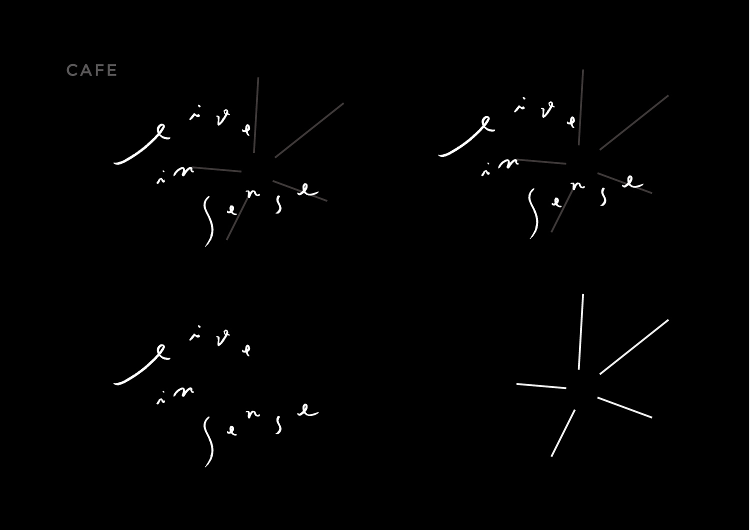
ショップマークのモノクロ表示 / Monochrome Version
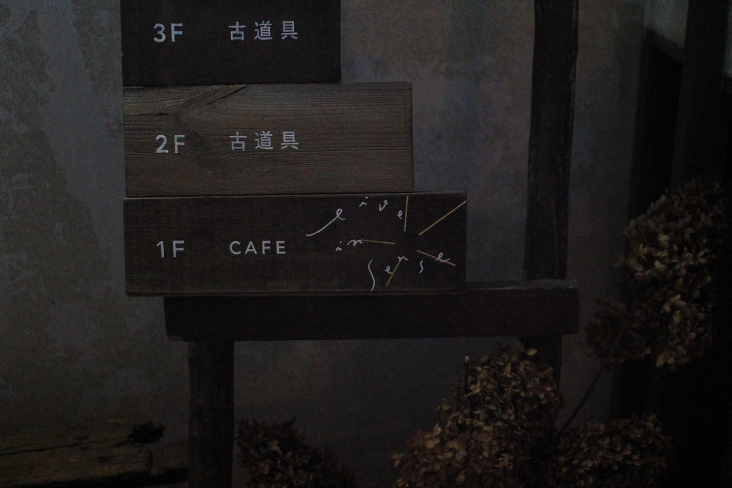
サイン / Signs (made by ReBuilding Center JAPAN)
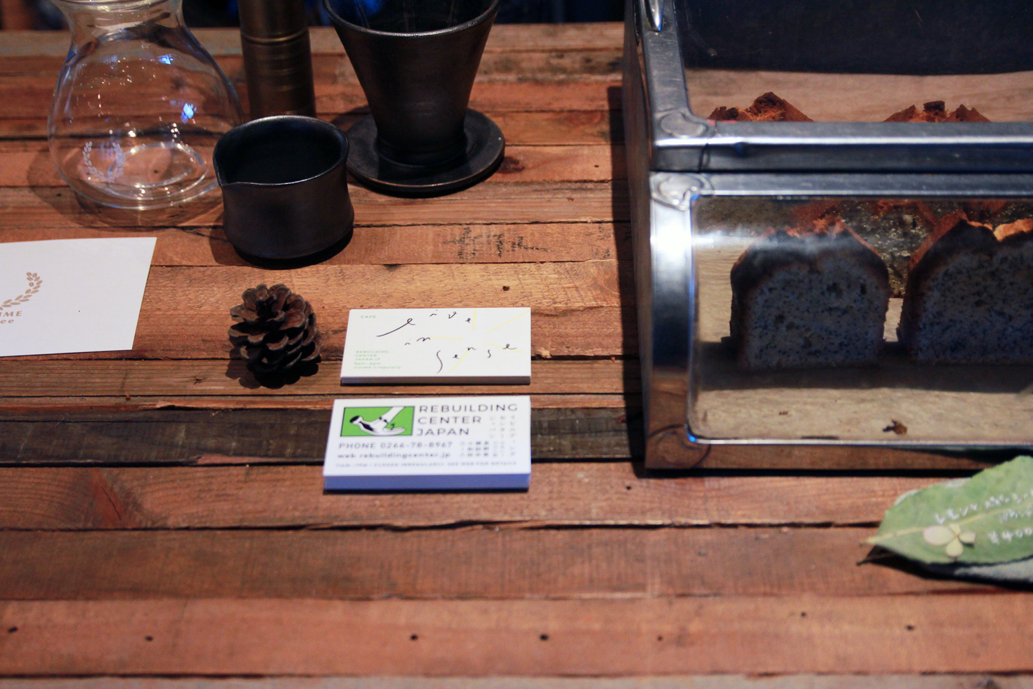
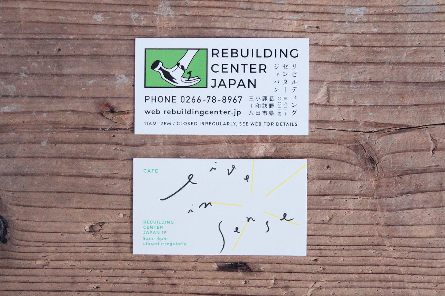
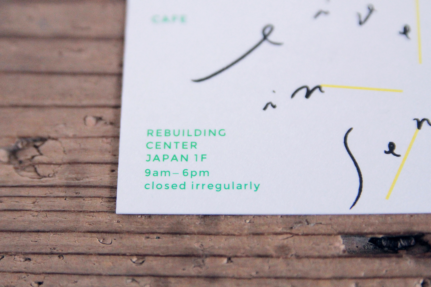
ショップカード / Shop Card
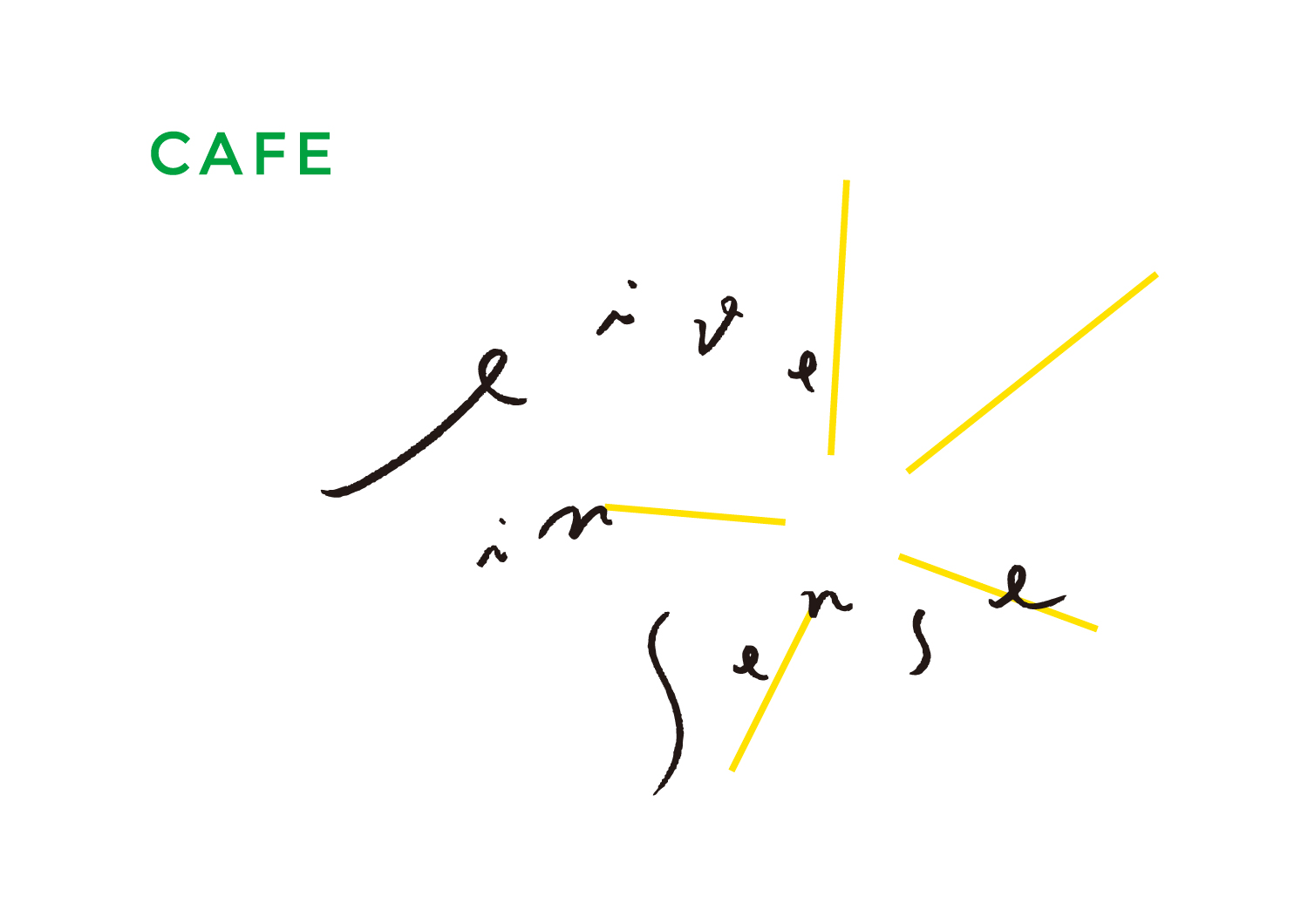
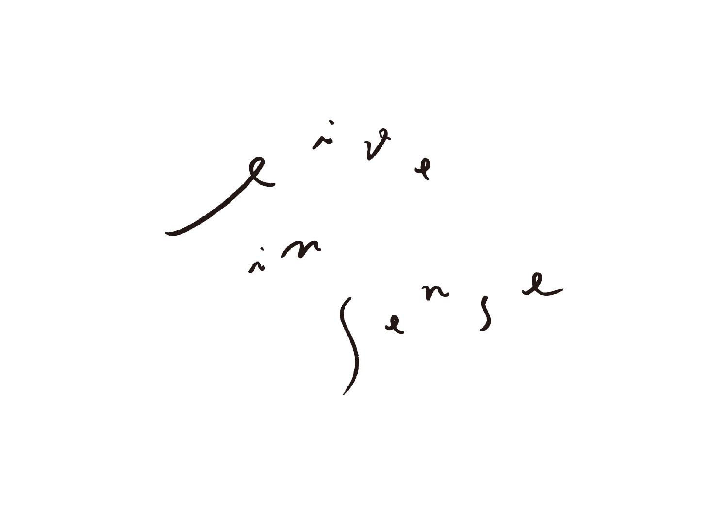
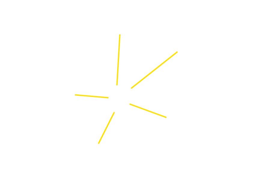
The cafe owner Kanako Azuno hopes that people feel everything with spreading their own sensitivity after touching, knowing, tasting, learning, watching and noticing them, and she named the cafe “live in sense.” The shop mark was designed based upon this meaning. At first, the form of shop mark does not fit particular shapes circle or square and it has a shape of a high degree of freedom including white space. The handwritten shop name is lively typography that looks like it’s going to start moving at any moment. On the other hand, yellow line behind the shop name was drew by straight lines of Illustrator, it expresses the shinning five senses. The character of ‘CAFE’ is used Montserrat that it is a corporate font of ReBuilding Center JAPAN, and it is green colour like the vast grassy plains that it can accept and pasture every senses. In this way, I designed it with mix together different elements.
ReBuilding Center JAPANの取締役で、カフェ店主の東野華南子さんが命名した「live in sense」は、「さわって、わかって、味わって、知って、見て、気づいて、感覚をのびやかにひろげて感じること。そうやって養った感覚と共に生きていくこと。」を意味している。そのため、ショップマークのシルエットは、円形や四角形などの「収まった形」にせず、余白も含め、自由度の高いフォルムに。店名は温度感のあるハンドライティングにし、今にも動き出しそうな、伸びやかで、躍動感のある書体。反対に、店名の背景に広がるイエローのラインは、Illustratorの直線ツールによる描写で、輝く五感を表現。「CAFE」の文字は、ReBuilding Center JAPANのコーポレートフォントのMontserratを、自由な感性を受け入れ、また放つことのできる、草原の色で印字。「感性とともに生きること、多様性を受け入れること」をモットーとするカフェのマークとして、店名、ヴィジュアル、表示それぞれに、異なる要素を用いて、ひとつのマークを象った。
Client: live in sense, ReBuilding Center JAPAN
Direction, Design, Handwriting: Go Uchida
Space Photo(the first photo): ReBuilding Center Japan
Printing Shop Card: Fujiwara Printing co.,ltd.